Archive for the ‘WWW’ Category

Google Labs have launched an accessible search engine. Accessible in both the sense that the search engine interface is more accessible (I haven’t evaluated this to see whether its true or not) and in that it aims to return accessible sites in the results.

“Accessible Search is designed to identify and prioritize search results that are more easily usable by blind and visually impaired users.”

A read of the FAQ reveals that the only sort of accesibility being considered at this time is visual impairment. This is a bit of a shame because it will reinforce the erroneous view that accessibility = blind. I hope that in the future it can be extended and customised to return results tailored to particular requirements.

The number of results returned is much lower, sometimes only 5% of the number returned by the main search.

The main Google site: Results 1 – 10 of about 3,370,000 for steve pugh. And pages related to me rather than the comics artist, etc. are at numbers two, four and five.

Accessible Google: Results 1 – 10 of about 157,000 for steve pugh. And pages related to me rather than the comics artist, etc. are at numbers two, three, four and ten.

One little thing I’ve noticed is that Wikipedia pages must be highly accessible according to Google as they come near the top in any search.

The main Google site: Results 1 – 10 of about 526,000 for tanita tikaram. And my site comes in at number two.

Accessible Google: Results 1 – 10 of about 57,900 for tanita tikaram. And my site is now at number one. The site TanitaTikaram.com (which uses frames) moves down from one to three. So frames don’t exclude you from these results but may hurt your position. Amazon doesn’t fair well, slipping from number ten to number thirty five.

Google indexes Flash, Word and Acrobat as well as HTML but I haven’t seen any such results yet. These formats can be made accessible but presumably Google’s spiders aren’t yet able to parse them for the signs that the authors have done so.

As with most products aimed at providing an accessible service, there are benefits for all users. If you find that Google often returns too many search results, and if you don’t want to see any paid links, and if you want to get results that only include easy to read and navigate pages, then this could be the search engine for you.

Meanwhile, I’m interested to hear what others in the accessibility field think.

I promised a test case for my latest problem and here it is: Gecko’s stubborn legend.

A few things worth noting:

  1. In reality the yellow background will be a gradiant background image within each box, so I can’t just apply the background to the form.

  2. Opera starts out displaying the upper form as FireFox does. The addition of position: relative (with no top, left, etc.) to the styles for legend magically changes that.

  3. IE7 breaks the * html hack so some further work will be needed to align the legend horizontally without breaking things in any other browser.

  4. Gecko doesn’t seem to apply float or display (except display: none;) to legend elements at all.

Tags:

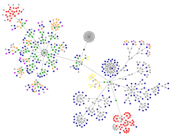
What’s that? That’s the output from a rather nifty applet that draws diagrams of the HTML structure of web pages (technically, it produces a graphical representation of a first order approximation of the DOM tree by examing element nodes only). In this case that’s the front page of Very True Things as of Thursday evening.

The big grey blob at the middle top is the page head, here full of the <link> elements that Word Press generates. The main content of the page is to the left and the side bar is to the right. The red clusters at top left and bottom right are tables – a meme result and the calendar respectively.

Have a look at the examples given by the creator to see how some big name sites compare. And then see the graphs for everyone else’s sites on Flickr. (Via Pharyngula.)

What’s really scary for me is that when I look at the graph for VL I can instantly spot where one extraneous (but harmless) link has been inserted by accident.


Got a good one today.

Dear Webmaster,

We found your web site, stevepugh.net from the internet and liked it very much! We hope you’ll consider exchanging links with our site, Octopus Links.

Our web site provides cutting edge Automated Link Exchange Services.
Lifetime membership to our services is currently FREE!
Please DOWNLOAD the attached web file to visit our site….

When you exchange links using our system, you can also exchange links with ALL our members. No more begging for links!

Have a nice day!
Jay, the Octopus

P/S: link exchange the fast and easy to to boost your web site search engine ranking and get an avalanche of free web traffic!!

There was no attachment for me to download to “visit their site” (i.e. get infected with a nasty virus). Fairless clueless even by spammer standards.

I decided to visit the domain used in the e-mail address, expecting to see either a link farm or something totally innocent and unrelated to the spam. Instead I saw a one page site with broken links and this:


This is how it works: Comment on this entry and I will give you a letter. Write ten words beginning with that letter in your blog, including an explanation what the word means to you and why, and then pass out letters to those who want to play along.

So gave me L

  1. Lettice
    Of course, the one and only , my wife. The source of much happiness, silliness and messiness.
  2. London
    My home for eight years and now my job. Huge, noisy, smelly, confusing, polluted, congested, over priced and badly run. Come to London and spend lost of money!
  3. Lock Forward
    My preferred position back when I played Rugby. Fine when I was at school as I was taller than most of my classmates but a bit tricker in the sixth form and at college when some people just kept on growing and I was relegated to being a roving utility forward (hated playing at prop, and flanker in today’s Rugby is just a back who pretends to be in the scrum). And yes, the locks are the ones who stick their hands between the prop’s legs – want to make something of that?
  4. Liberal
    I’m far too lazy to understand the nuances of political philosophy but being liberal puts one in the middle of the spectrum in Europe and in clear opposition to Bush at al. in the US. And that can’t be too bad a place to be can it?
  5. Links
    The web wouldn’t be the web without them. The implementation of inks in HTML/HTTP is primitive compared to most hypertext systems but the simplicity of a one way, stateless system of linking is what allowed the web to take off.
  6. Leather
    Sorry veggies. A good leather jacket can’t be beaten for looks and practicality. And then there’s skin tight shiny leather, mmmm…
  7. Laughter
    See also Lettice. I like laughing, who doesn’t?.
  8. Learning
    I never want to stop learning. Though unlike some people this doesn’t mean that I want to be a perpetual student. 😉
  9. Lead
    Actually most of my little friends aren’tr pure lead, and many have very little or no lead in them at all these days. The lead started to go out of toy soldiers over ten years ago when some US states brought laws in out of fear of lead poisoning. Never mind the termial kinetic energy poisoning from lead bullets…
  10. Looms
    See also Lettice. I don’t know much about looms but they seem to cause equal measures of joy and stress to my beloved.

So here I am admiring the free Arthur and Mordred figures from Salue on Saturday and I see that there are already three for sale on eBay.


Four posts in one day and it’s only two o’clock – can you tell that I don’t have a lot to do at work today? Mostly because I don’t really dare touch anything until the java boys (like java man but less hairy) have stopped beating the database with large sticks.

Anyway, want to see one of my favourite web sites? Dino Directory at the NHM is a very neat little site. A database of dinosaurs with a nice web front end that allows users to search and sort the data by a wide range of criteria – the large graphics lead novice users into a simple search by body shape function, whilst more advanced functions such as grouping by geographic and chronological proximity are readily available for more adventurous users. And then the results link through to the NHM‘s picture library which is another hidden gem in itself.

It’s a shame that the front end coding isn’t as nice as the information architecture. Looking at the code it seems that the header and footer were created by someone who knows what they’re doing – CSS layout, accessible, etc. Whilst the actual Dino Directory code in the middle is tables based and full of errors. Shame.

There’s also an RSS feed to keep user up to date with the latest dinos to be added. This week saw the addition of the very cute sounding Wannanosaurus. Oddly, this seems to be the only RSS feed on the whole NHM site.

Anyway, here’s a lovely site based on a great idea and well implemented (just needs a little work to make it standards compliant and accessible), but… it’s very Web 1.0 isn’t it? How could one jazz this up to make it Web 2.0? Define a dinosaur microformat and provide an API to allow dino data to be reused on other sites? Allow users to drag and drop dinosaurs into a personal folder and then play top trumps with other users? Or, if it ain’t broken, don’t try to make it buzzword compliant?


A certain site checking service (who have managed to bamboozle a large number of public sector bodies into paying attention to their ‘league tables’) complains about Very True Things because it claims that –

Tag 'del' may not come under tags 'p' or 'div'
Tag 'ins' may not come under tags 'p' or 'div'

What’s more it claims that these problems make the page invalid and that its validity checks are carried out in accordance with the HTML 4.01 specification.

Very True Things is XHTML 1.0 not HTML 4.01. What’s more it did at the time of the test contain a deprecated attribute which whilst picked up by said checker was not listed as a validation fail, despite the fact that I use a Strict doctype. Any system that claims to report on validity should at least check the doctype and apply the appropriate rules.

More importantly, ins and del are very odd elements.
As the XHTML DTD says:

<!-- these can occur at block or inline level -->
<!ENTITY % misc.inline "ins | del | script">

The HTML DTD is a little more difficult to read as it relies on an SGMLism not much used in HTML:

<!ELEMENT BODY O O (%block;|SCRIPT)+ +(INS|DEL) -- document body -->

But in either case the validator will confirm that ins and del can appear just about anywhere in the document, and can certainly be used within a p and div elements.

So next time your client or boss gets hassled by a salesman from this company (fvgr zbefr) you can tell that they don’t know what they’re talking about and should be ignored.


A followup to my last post about unobtrusive fieldsets and legends. Safari and Konquerer are applying the relative positioning just as Opera does. But they had already removed all indent on the legend as Gecko does. This is a problem as both Opera and Safari are under constant developement and have good CSS support. So how do we distinguish between them?

There are some CSS hacks that cause code to be treated differently by these browsers but instead of relying on poor CSS parsing in older browsers (as in most IE5 hacks) they rely on parts of the CSS spec that aren’t supported yet (e.g. the :lang hack). But Opera 9.1 or Safari 2.1 might well support them, rendering the hack useless.

And it’s not a case of one browser being wrong, legend elements are somewhat peculiar and the default implementation of their presentation can legitimately vary between browsers.

So unless anyone knows a good way to feed different styles to Opera and Safari (that doesn’t rely on browser sniffing, either via JavaScript or server side languages) all I can suggest is that you either use the negative left margin method and accept that Opera will indent the legends, or use the relative positioning method and accept that Safari will outdent the legends. The former method is probably less risky but irks me as an Opera user.

Tags:

I was tidying up some web pages (Goodbye single column table, hello unordered list; goodbye multiple level one headings, hello heading hierarchy) when I came across a heading followed by a group of checkboxes. Looks like a fieldset with a legend, I thought, but the page design really wouldn’t be helped by the default presentation of these elements in most browsers. So how make to make these elements completely unobtrusive?
Read the rest of this very true thing…

Tags: